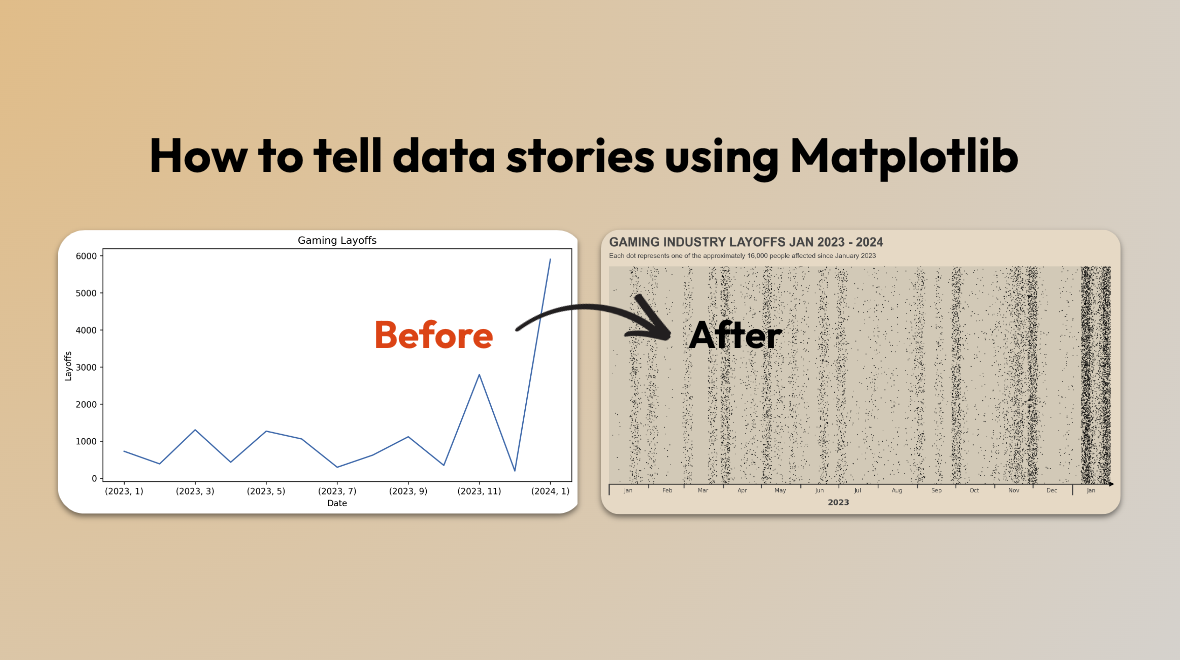
Recreating PC Gamer’s Layoff Chart with Matplotlib and Pandas: Transforming a Line Graph into a Story
Gaël Grosch
/
In this series, we embark on a journey to create compelling data visualizations inspired from leading data journalism newspapers and online data-driven website. Today, we try to replicate a great chart featured in PC Gamer, showcasing the Gaming Industry layoffs.
What makes this visualization particularly intriguing is its departure from the traditional line chart format. Instead, it employs a more immersive approach, utilizing a scatter plot where each dot signifies a single layoff. This subtle change create an emotional connection, as each dot represents an individual who has lost their livelihood. This exemplifies the key difference between analyzing data and effectively narrating a story through data.
In the rest of the article, we will try to replicate this chart using Pandas and Matplotlib.
Loading the data
The data used in the article is not provided, however they link to their sources of data. Today, we will only use one of the source. The data will be similar but not exactly the same. We will use the Game Industry Layoffs Dataset from Obsidian. On the page, we can find a link to an AirTable where one can download a CSV for each year.
Once download, we can load the data with Pandas:
import glob
import os
import pandas as pd

# The data is stored in a directory with one CSV per year. Change the directory name accordingly
path = './data/gaming-layoff/'
all_files = glob.glob(os.path.join(path, "*.csv"))     # advisable to use os.path.join as this makes concatenation OS independent

# Load all the CSVs into a single dataframe
df = pd.concat((pd.read_csv(f) for f in all_files), ignore_index=True)
# Lowercase the column names
df.columns = (col.lower() for col in df.columns)
# Convert the date column to datetime
df['date'] = pd.to_datetime(df['date'])
# Keep only the data after 2023-01-01
df = df.query("date >= '2023-01-01'")
Let’s have a look at the data on a monthly basis:
df.groupby(by=[df['date'].dt.year, df['date'].dt.month]).headcount.sum().plot(title="Gaming Layoffs", ylabel="Layoffs", xlabel="Date", figsize=(10, 5))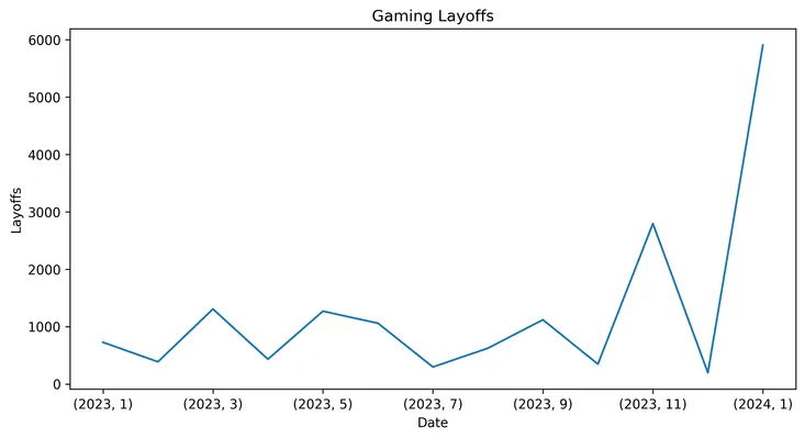
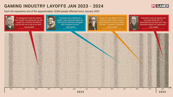
This is where the PC Gamer plot becomes interesting. They could have shown the layoffs over time with a simple line chart. However, they chose to use a scatter plot with each dot representing a layoff. This creates a more emotional connection to the data.
From a Line Chart to a Scatterplot
To replicate the PC Gamer chart, we will need to employ a few strategies. Initially, in our original dataset, layoffs are recorded by day and company, lacking the granularity needed to discern individual layoffs. To address this limitation, we will implement two techniques:
- Create a y-axis where individual layoffs are randomly distributed, providing space for each to be represented as distinct points, even if they occur on the same date.
- Given that certain days witness a surge in layoffs, we introduce randomness to the dates to horizontally disperse the points and prevent overcrowding.
By implementing these methods, we can effectively visualize individual layoffs despite the aggregation of our data by day and company. We shift from mere data analysis to compelling storytelling through a simple data transformation
# Explode the dataset to get 1 row per layoff
df_per_head = df[["date"]].loc[df.index.repeat(df.headcount)]

# Spread the dates out randomly over an interval of 7 days
df_per_head["date_randomized"] = df_per_head["date"] + pd.to_timedelta(np.random.rand(len(df_per_head)) * 24 * 7, unit="H")
# Add a random y value between 0 and 1
df_per_head["y"] = np.random.rand(len(df_per_head))
Now let’s visualize our data with a scatter plot:
df_per_head.plot(x='date_randomized', y='y', title='Gaming Layoffs', ylabel='Layoffs', xlabel='Date', figsize=(10, 5), kind='scatter')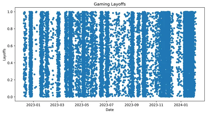
We can see the raw data start looking similar to the PC Gamer chart (Note: we are using a different dataset, some layoffs are missing). Now, let’s refine the plot’s style to closely mirror the original.
Styling the Scatter Plot
Let’s utilize Matplotlib to recreate the visual aesthetics of the PC Gamer chart. Our focus will be on emulating the scatter plot, excluding the testimonials featured in the original.
To begin, we’ll define color schemes and set background colors.
import matplotlib.pyplot as plt
import matplotlib
matplotlib.rcParams["figure.dpi"] = 300

# Define useful colors
GREY10 = "#1a1a1a"
GREY30 = "#4d4d4d"
GREY40 = "#666666"
BACKGROUND_COLOR = "#eedccb"
BACKGROUND_AXES_COLOR = "#dbcebe"

# Create the plot
fig, ax = plt.subplots(figsize=(8, 3.5))
ax.scatter(df_per_head['date_randomized'], df_per_head['y'], s=0.4, linewidths=0.02, c='black')

# Set background colors
fig.patch.set_facecolor(BACKGROUND_COLOR)
ax.set_facecolor(BACKGROUND_AXES_COLOR)
Then let’s work on setting up the base for the axes
# Axes
from datetime import datetime
ax.set_xlim(datetime(2023, 1,1),datetime(2024, 1,31))
ax.set_ylim(0, 1)

# Remove uneeded spines
ax.spines["left"].set_color("none")
ax.spines["right"].set_color("none")
ax.spines["top"].set_color("none")
ax.spines['bottom'].set_color(GREY10)

# Remove y axis ticks and labels
ax.yaxis.set_ticks([])
ax.yaxis.set_ticklabels([])
To achieve the same appearance as the original plot, we’ll implement two x-axes: one for displaying the month and another for displaying the year. We’ll utilize the matplotlib.dates module to customize the labels and tick locations for both month and year.
# We will split the x axis into 2 parts: months and years
# 1. Month x-axis
import matplotlib.ticker as ticker
import matplotlib.dates as dates

# Define Major axis that we will use for the ticks (and hide the labels)
ax.xaxis.set_major_locator(dates.MonthLocator())
ax.xaxis.set_major_formatter(ticker.NullFormatter())
# Define a minor axis centered on the 16th of each month where we will place the x-axis month labels
ax.xaxis.set_minor_locator(dates.MonthLocator(bymonthday=16))
ax.xaxis.set_minor_formatter(dates.DateFormatter('%b'))

# Month x-axis: Tick style
ax.tick_params(axis='x', which='minor', length=0) # Remove
ax.tick_params(axis='x', which='major', pad=2, color=GREY30)

# Month x-axis: label style
for label in ax.get_xticklabels(minor=True):
    label.set_color(GREY30)
    label.set_size(5)
    label.set_horizontalalignment('center')

# Month x-axis: Add arrow at the end of the x-axis
ax.plot(1.002, 0, "k>", transform=ax.get_yaxis_transform(), clip_on=False, markersize=3)

# 2. Year x-axis
ax2 = ax.twiny()
ax2.set_xlim(ax.get_xlim())

# Hide all the axes
ax2.spines["left"].set_color("none")
ax2.spines["right"].set_color("none")
ax2.spines["top"].set_color("none")
ax2.spines["bottom"].set_color("none")
# Position the new axes, labels and ticks below the existing (Month) one
ax2.spines["bottom"].set_position(("axes", -0.05))
ax2.xaxis.set_ticks_position('bottom')
ax2.xaxis.set_label_position('bottom')

# Define Major axis that we will use for the ticks (and hide the labels)
ax2.xaxis.set_major_locator(dates.YearLocator())
ax2.xaxis.set_major_formatter(ticker.NullFormatter())
# Define a minor axis centered on the 7th Month we will place the x-axis year labels
ax2.xaxis.set_minor_locator(dates.YearLocator(month=7))
ax2.xaxis.set_minor_formatter(dates.DateFormatter('%Y'))

# Year x-axis: Tick style
ax2.tick_params(axis='x', which='minor', length=0) # Remove
# direction='in' is a trick to connect the tick line to the main axis
ax2.tick_params(axis='x', which='major', length=10, width=1.15, direction='in', color=GREY30)

# Year x-axis: label style
for label in ax2.get_xticklabels(minor=True):
    label.set_color(GREY30)
    label.set_size(7)
    label.set_fontweight('bold')
    label.set_horizontalalignment('center')
Finally we can add a title and subtitle to the plot:
# Add title and subtitles
fig.text(
    0.125, # x-coordinate
    0.95, # y-coordinate
    "GAMING INDUSTRY LAYOFFS JAN 2023 - 2024",
    color=GREY30,
    fontname="Arial",
    fontsize=11,
    weight="bold"
)

# Subtitle
fig.text(
    0.125, # x-coordinate
    0.91, # y-coordinate
    "Each dot represents one of the approximately 16,000 people affected since January 2023",
    color=GREY30,
    fontname="Arial",
    fontsize=6,
)

plt.show()
The plot generated closely resembles the PC Gamer Layoff plot, achieved through the application of Pandas and Matplotlib.
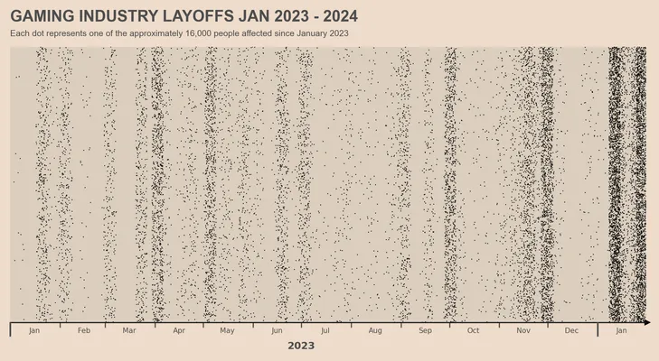
Despite its close resemblance, there are a few discrepancies:
- The absence of the 2024 label.
- Differences observed in the end arrow on the x-axis.
Although these elements can be enhanced further, I’ve encountered challenges in finding the optimal implementation. If you have any insights or suggestions to refine these aspects, I’d greatly appreciate your input.
Results and learnings
This article highlights a simple yet effective method to transform aggregated data into a compelling visualization, emphasizing the individual aspects through the use of dots. By employing various techniques to distribute the data and styling the plot with Matplotlib, we successfully replicated the essence of the original PC Gamer chart.
This is a good example of how data can be turned into a story, showcasing the importance of data visualization, not only as a tool for analysis but also as a means of storytelling.
Full Code source available on Github: PC Gamer Industry Layoff Plot with Pandas and Matplotlib
Stay tuned for more articles in this series, where we will continue to explore and recreate various styles using Matplotlib, Seaborn, Plotly, or even ggplot! Visit my website gael.io for more articles and tutorials.