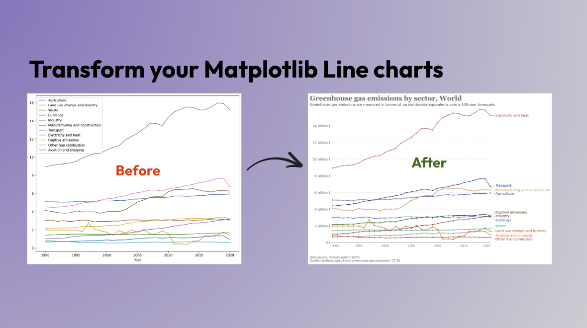
Beautiful Line Charts with Matplotlib: Lessons from OurWorldInData
Gaël Grosch
/
In this series, we aim to transform Matplotlib and Seaborn plots into engaging data visualizations. We draw inspiration from leading data journalism newspapers and online data-driven websites, such as The Economist, The Guardian, and others.
Today, we will focus on OurWorldInData, a platform that provides comprehensive and accessible data on global development. OurWorldInData is known for its clean and impactful visual style, which we aim to replicate in our Matplotlib visualizations.
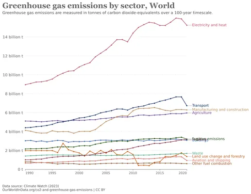
In this article, we will reproduce a Line Chart of Global Greenhouse Gas Emissions by Sector using Matplotlib:

Let’s get to work 🧑💻
Loading the data with Matplotlib
Matplotlib default charts are functional but not always engaging. They often lack visual appeal and can easily distract a non-technical user. After having loaded the data with pandas (code here). Here is the default Matplotlib line chart for our dataset:
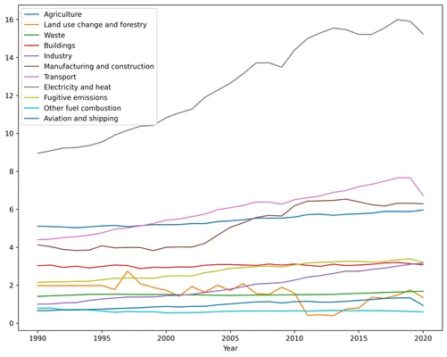
As one can see, we have a lot of work to do to make our plot look like OurWorldInData. Let’s start by breaking down the key elements and the steps we need to take to accurately replicate these elements:
- Headings and sources: The original figure contains various elements that give context to the plot such as the title, subtitle, and sources. We will need to add these elements to our plot.
- Chart Axes: The original figure has a clean and minimalistic look. It has removed various elements and made extensive use of grey to minimize distractions.
- Data Series: Each individual data series is plotted with a unique color and annotations at the end of each line offer direct identification of each series, eliminating the need for a separate legend.
Let’s see how we can achieve these elements in our plot with Matplotlib.
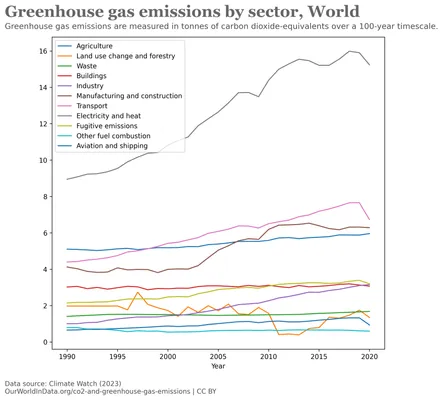
Improvement #1: Adding Headings and Sources
To replicate the detailed context provided by OurWorldInData, we start by adding a title, subtitle, and source information to our Matplotlib plot. Although this can be also be done using the text and suptitle functions, we use fig.text for exact positioning and detailed styling.
# Defining a palette of shades of gray (do not worry there is not 50 of them)
GREY10 = "#1a1a1a"
GREY30 = "#4d4d4d"
GREY40 = "#666666"
GREY75 = "#bfbfbf"
GREY91 = "#e8e8e8"

fig.text(
    0.015, 0.93, # (x,y) coordinates
    "Greenhouse gas emissions by sector, World",
    color=GREY40, fontname="Georgia", # Serif font
    fontsize=24, weight="bold"
)

# Subtitle
fig.text(
    0.015, 0.90, # (x,y) coordinates
    "Greenhouse gas emissions are measured in tonnes of carbon"
    " dioxide-equivalents over a 100-year timescale.",
    color=GREY30, fontsize=12,
)

# Legend
fig.text(
    0.015, 0.04, # (x,y) coordinates
    "Data source: Climate Watch (2023)\n"
    "OurWorldInData.org/co2-and-greenhouse-gas-emissions | CC BY",
    fontsize=10, color=GREY30
)
Which generates the following plot:
In Matplotlib, the placement of the text is tedious and requires trial and error to ensure that the elements are aligned and spaced correctly. Make sure you have the right plot size before starting to place the text.
Improvement #2: Replicating Chart Axes
To achieve the minimalistic aesthetic of the OurWorldInData chart, we’ll modify the axes of our Matplotlib plot. This includes many settings such as background color, hiding specific spines, and using grey for grid lines and tick labels:
# Manually set axes range
ax.set_xlabel("")
ax.set_xlim(1990, 2020)
ax.set_ylim(0, 16)

# Keep only the bottom axis
ax.spines["left"].set_color("none")
ax.spines["right"].set_color("none")
ax.spines["top"].set_color("none")

# X-axis: Change colors axis and label
ax.spines['bottom'].set_color(GREY40)
ax.tick_params(axis='x', colors=GREY40)
ax.xaxis.label.set_color(GREY40)

# X-Axis: Position ticks center, except for first and last
for tick in ax.xaxis.get_major_ticks():
    tick.label1.set_horizontalalignment('center')

ax.xaxis.majorTicks[0].label1.set_horizontalalignment('left')
ax.xaxis.majorTicks[6].label1.set_horizontalalignment('right')

# Y-axis: Add vertical gridlines every 2 billion tons
for h in HLINES:
    ax.axhline(h, color=GREY91, lw=1, zorder=0, linestyle="--")

# Y-Axis: Remove y ticks
ax.yaxis.set_tick_params(width=0)

# Y-axis: Change y axis labels to have Unit#
ax.set_yticklabels(
    [f"{y} billion t" if y!=0 else "0 t" for y in np.arange(0, 16, 2)],
    fontsize=12,
    weight=500,
    color=GREY40
)
Which generates the following plot:
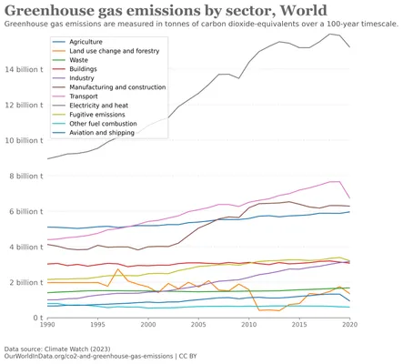
Notice the following:
- On the x-axis, the labels do not extend beyond the axis limits. This is achieved by modifying the alignment for the first and last label
- The different greys minimize distractions, ensuring that attention remains focused on the crucial elements of the plot.
Improvement #3: Adding colored Data Series and annotations
Finally, we will replicate the line plots and annotations similar to those in our OurWorldInData’s chart. To do that, we will create the line plot and add the annotations and arrow for each series.
# OurWorldInData color palette
COLOR_SCALE = [
    "#6D3E91", "#C05917", "#58AC8C", "#286BBB", "#883039", "#BC8E5A", "#00295B", "#C15065",
    "#18470F", "#9A5129", "#E56E5A", "#A2559C", "#38AABA", "#578145", "#970046", "#00847E",
    "#B13507", "#4C6A9C", "#CF0A66", "#00875E", "#B16214", "#8C4569", "#3B8E1D", "#D73C50"
]

# Remove existing legend
ax.legend().remove()

# Define margin around annotation
PAD = 0.1

# For each timeserie
for idx, column in enumerate(df_grouped.columns):
    # 1. Pick a Color from OurWorldInData palette
    color = COLOR_SCALE[idx]

    # 2. Plot each line with some round markers
    ax.plot(
        df_grouped.index, df_grouped[column],
        color = color, label=column, marker="o",
        markersize=2.5, lw=1.2, clip_on=False
    )

    # 3. Add annotation with name of each serie
    y_end_value = df_grouped[column].iloc[-1]
    annotation_x = 2021
    annotation_y = y_end_value
    ax.text(
        annotation_x, annotation_y + y_offset, column,
        color=color, fontsize=12, va="center"
    )

    # 4. Add arrow between line to annotation
    line_chart_x_end = 2020 + PAD
    line_chart_y_end = y_end_value
    ax.arrow(
        line_chart_x_end,line_chart_y_end,
        1-2*PAD, 0,
        clip_on = False, color=GREY75
    )
Resulting in the following plot:
Please note:
- the use of
clip_on=Falsein the plot method to ensure that the lines extend beyond the axis limits, allowing the arrows to be placed at the end of each line. It is also used to prevent Matplotlib from clipping the rounded markers at the start and end of each line.
We are getting very close to the OurWorldInData line chart. However, the annotations are overlapping which makes it difficult to read the names of the series. We will address this in the next section.
Improvement #4: Fix overlapping annotations
Matplotlib does not provide a straightforward way to add non-overlapping annotations. For now, we will fix the overlaps by manually adjusting the arrows and annotations. I will look into sharing code to automate it in the future but, for now, that will do:
y_offsets = [-0.1, 0.05, 0.3, -0.4, 0, 0, +0.1, 0, +0.4, -0.2, -0.1]
...
# 3. Add annotation with name of each serie
y_end_value = df_grouped[column].iloc[-1]
y_offset = y_offsets[idx]
annotation_x = 2021
annotation_y = y_end_value + y_offset # Add Offset
ax.text(
annotation_x, annotation_y + y_offset, column,
color=color, fontsize=12, va="center"
)
# 4. Add arrow between line to annotation
line_chart_x_end = 2020 + PAD
line_chart_y_end = y_end_value
ax.arrow(
line_chart_x_end,line_chart_y_end,
1-2*PAD, y_offset, # Add offset
clip_on = False, color=GREY75
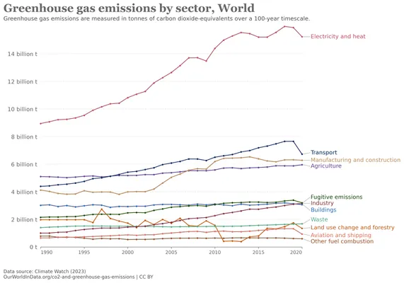
)which generates our final plot:
Results and learnings
The result is not exact, we did get pretty close:
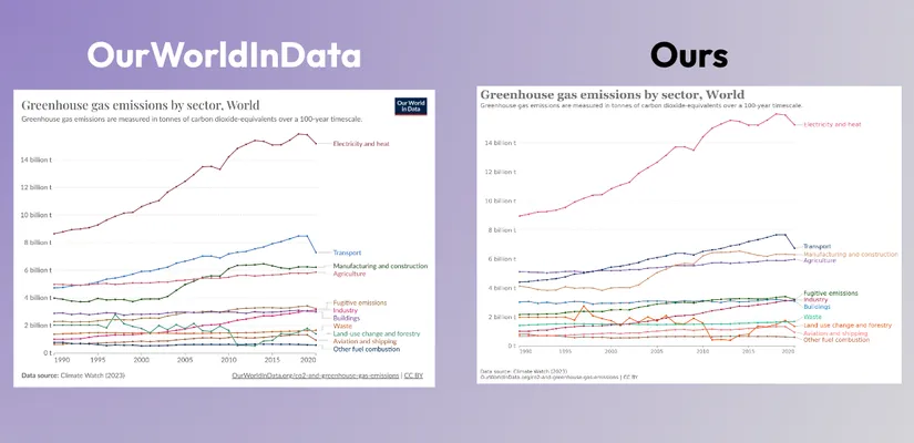
While th Matplotlib library is quite powerful, it can be challenging and time-consuming to achieve the desired visual style. Navigating the Matplotlib API and options can often be challenging. In the next months, I will continue exploring how to make that easier, so please follow or reach out to me if you are interested in this topic.
Full Code source available on Github: OurWorldInData Line Chart with Matplotlib
Stay tuned for more articles in this series, where we will continue to explore and recreate various styles using Matplotlib, Seaborn, Plotly, or even ggplot.