DataViz Mentor - Enhance your Data Visualizations
Gael Grosch
/
Following the launch of the GPT Store, I have been exploring the potential of GPTs. I am excited to announce the release of my first GPT called DataViz Mentor. It is now available for free to all ChatGPT Plus subscribers who want to improve their data visualizations.
Enhance your Presentations and Data Visualizations with DataViz Mentor
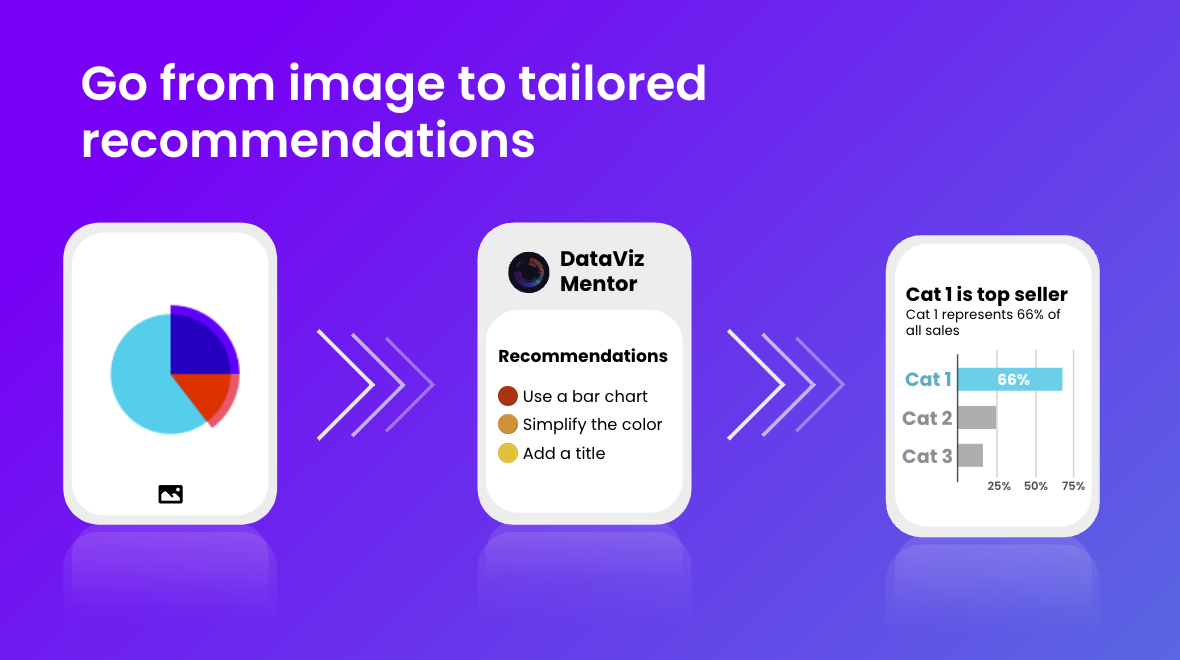
Creating quality data visualizations often requires significant time and expertise. DataViz Mentor aims to simplify this process. It serves as an assistant or “mentor,” offering immediate feedback on your visualizations. It guides you with prioritized improvements that can be made to any data visualization or plot.
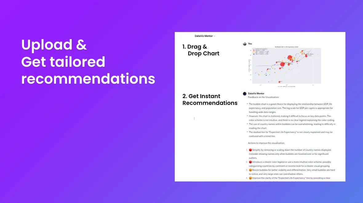
To use DataViz Mentor, visit the ChatGPT interface and follow these steps:
- Upload an image of your plot.
- Receive prioritized recommendations for improvement.
How It Works
The recommendations are derived from my work compiling books, blog posts, and other resources into a methodology for assessing data visualizations. I have gathered and summarized common mistakes, as well as providing recommendations to fix them. The system uses this knowledge for its assessments.
Utilizing GPT-4 turbo’s language and vision capabilities, the system is then able to combine its knowledge with the uploaded image to provide guided recommendations.
I will share more details on creating and publishing such a GPT in a future blog post (Stay tuned 😊)
Real-world Examples
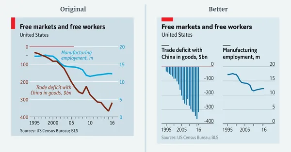
To evaluate the system, we’ll examine if it aligns with some of The Economist’s suggestions. In a Medium blog post, journalist Sarah Leo from The Economist discusses some past mistakes they’ve made. They showcase the initial visualization and the improved version. Let’s see if DataViz Mentor agrees with their recommendations.
Example 1: Recommending splitting the chart into 2
The first example from The Economist is as follows:
Below are DataViz Mentor’s recommendations (for the left plot):
The mentor agrees with The Economist, and its first recommendation suggests using two separate visualizations, as recommended by The Economist author.
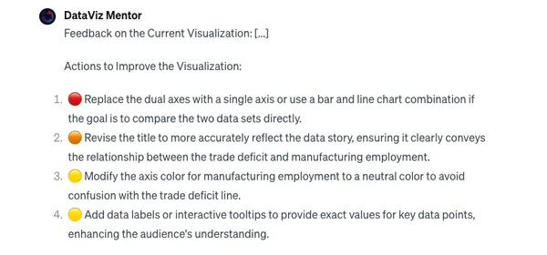
Example 2: Recommending reworking the axes
In another example from The Economist, this time looking at the correlation between 2 variables:
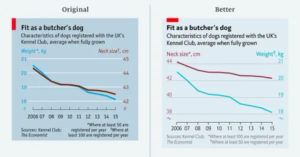
Similarly, here are DataViz Mentor’s recommendations for the first (left) plot:
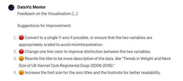
It points out the misleading y-axis and suggests alterations, along with subtle changes in color and font size, matching the recommendations and the updated version.
Improvements and Future Plans
Although the initial version is already quite helpful, the system is the first iteration and is not (yet) perfect. Some of the improvements I am planning to work on are:
- Helping you implement the recommended changes in your data visualization software or framework: Assisting you in easily modifying your original plot is very important. This is a difficult challenge given the variety of tools available today, but an important one to tackle.
- Improving the vision and recommendations: While the system generally offers solid recommendations, it might occasionally miss or misunderstand certain plot elements.
I need your help!
While I have some ideas on how to improve the system, they are just that: ideas. I need your help to turn them into actionable improvements.
If you have any feedback or impressions, please reach out. Finally, if you’re interested in data visualization or GPTs, let’s connect and chat about the topic!